Mark Twain once said something along the lines of, “The fear of death follows from the fear of life. A government logo who lives fully is prepared to die at any time.” And over the years since our countrymen first started drawing circles with eagles inside of them, many logos–along with their organizing bodies–did die.
Plucked from university digital library troves, Google Books, Wikipedia, the National Archives, obscure depths of government websites, creepy personal blogs, and other dusty corners of the internet we do not recommend visiting, these are some of the retired, dormant, or long-dead federal agency logos we found the most interesting (both visually and existentially). Cropped, edited, enhanced, and sometimes reproduced entirely, they are presented below in no particular order:

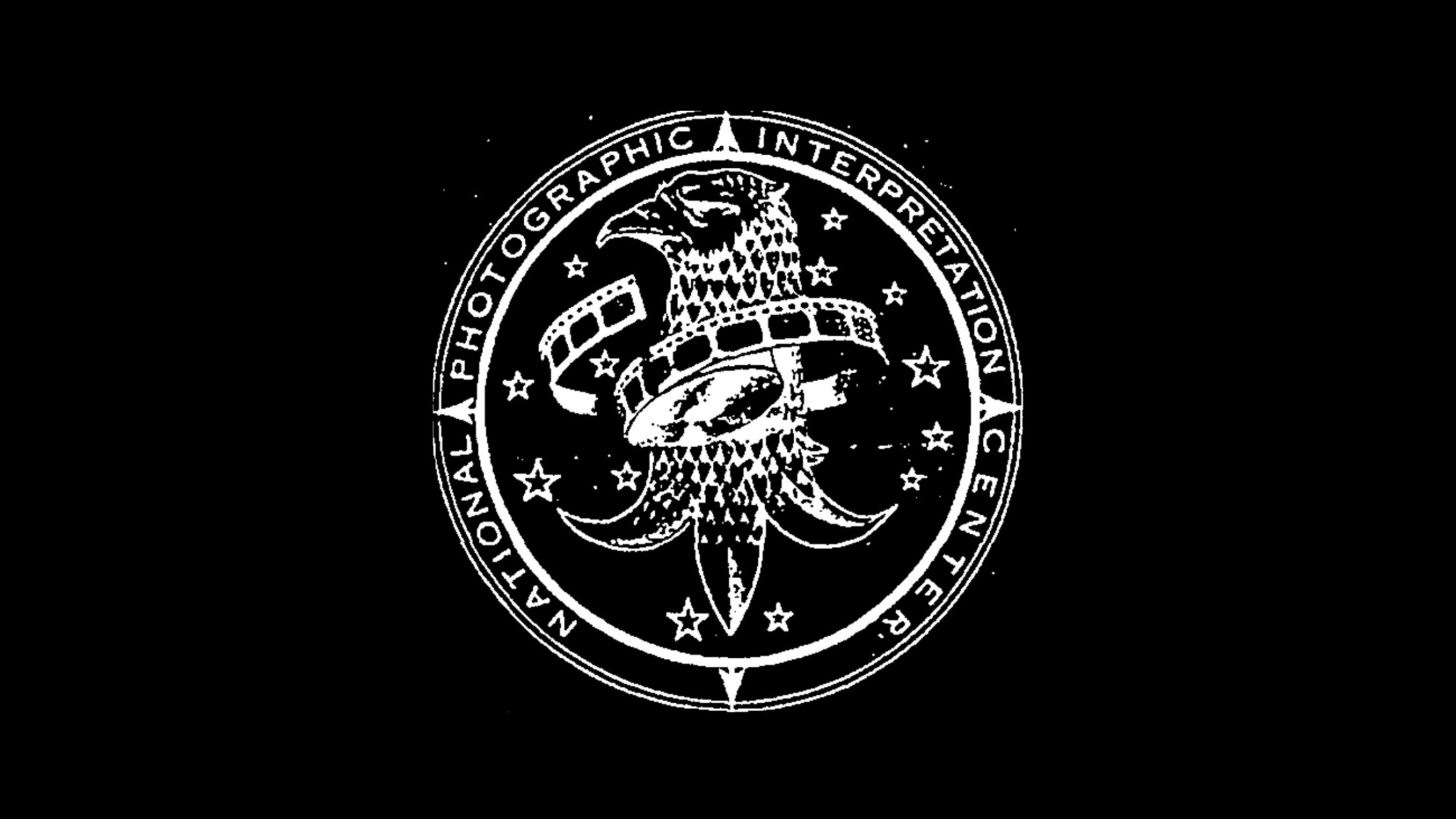
National Photographic Interpretation Center (NPIC), 1961-1996
Dwight Eisenhower created the NPIC in the final days of his presidency in 1961. A scrappy agency under the leadership of the CIA at the time, it would probably have been most occupied by matters involving the Cold War and the Cuban Missile Crisis. The seal reveals the defining moment our national symbol the bald eagle, became an omniscient and self aware photographic analysis expert, entangling itself in an old film strip of random vacation photos. The eagle was trained to interpret images as it saw fit in the name of national security.

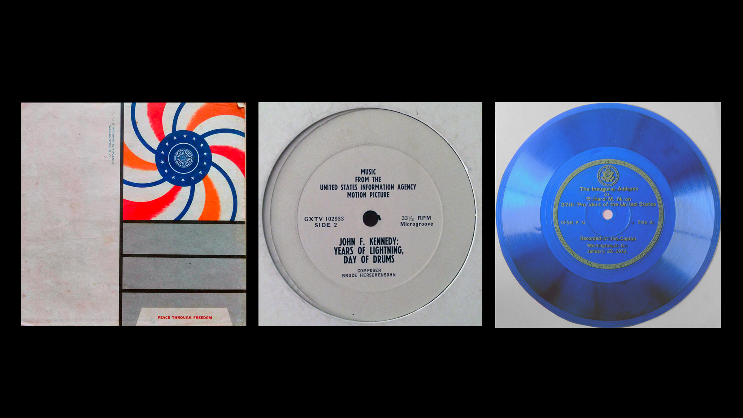
United States Information Agency (USIA), 1953-1999
The USIA was a very large public relations agency–the largest in the world at the time–whose primary target audience was everyone alive. Established by Eisenhower in 1953, the boutique experiential creative studio would spread cheer, good vibes, and decidedly anti-Soviet propaganda across the globe (mostly in the form of radio broadcasts and media pieces) until 1999 when it extended its usefulness beyond practicality and was dissolved.
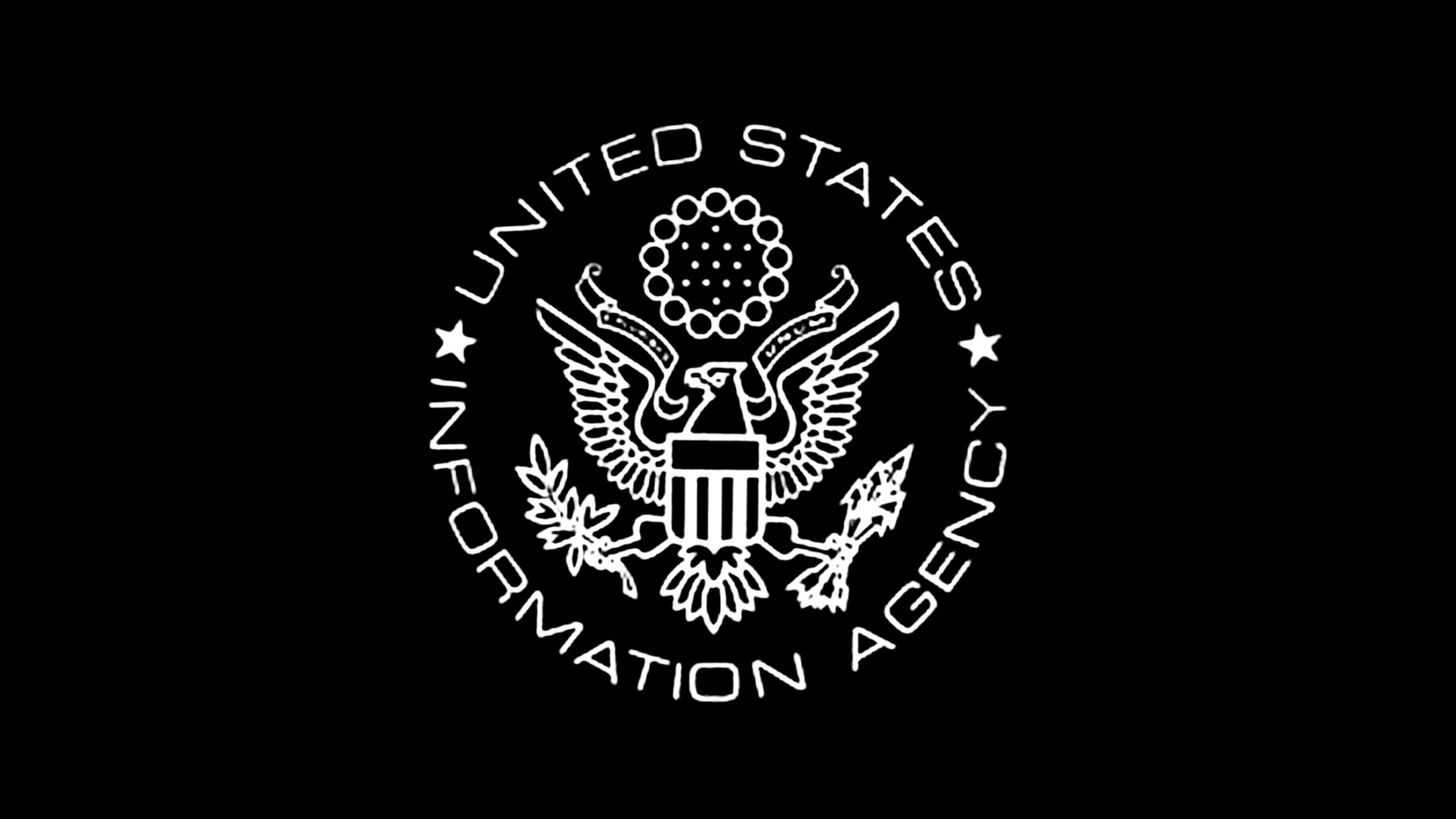
The logo displayed here was not the official seal but an alternative and much cooler version used on John W. Henderson’s thick historical account of the agency. According to Robert Elder’s The Information Machine: The United States Information Agency and American Foreign Policy, “[t]he USIA flexed it’s PR muscles with “personal contact, radio broadcasting, libraries, book publication and distribution, press motion pictures, television, exhibits, English-language instruction, and others”.

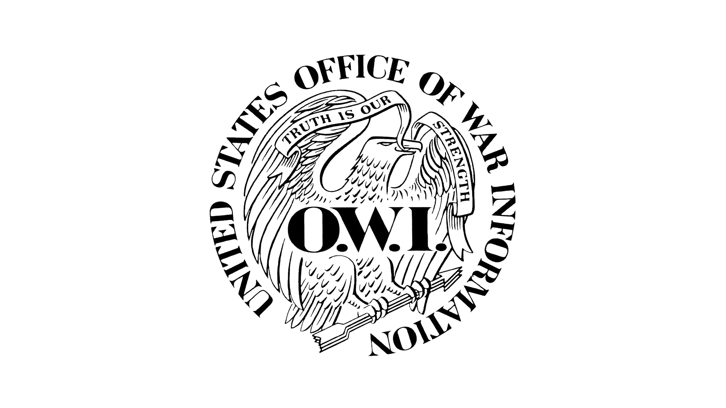
United States Office of War Information (OWI), 1942-1945
OWI was created during WWII to control messaging through radio broadcasts, newspapers, posters, photographs, and other forms of media. The serifed font along the perimeter of the seal is actually typeset really well by most standards–let alone for a 1940’s-era government design–with tight kerning and thoughtful balance. Per usual, the eagle is present doing anthropomorphized tough-guy poses.


Office of Strategic Services (OSS), 1942-1945
The OSS was a WWII-era precursor to the CIA and had a pretty bad logo all around. The beloved cooking teacher and television personality, Julia Child, would likely have seen this underwhelming and frankly quite phoned-in logo on many of the documents she would file and transcribe when she worked at the agency as a typist and shark-repellent expert. In this logo the beloved eagle appears more like a squab, which Julia also made famous with a recipe paired with liver canapés.

United States Office of Technology Assessment (OTA), 1972-1995
The Office of Technology Assessment was created in 1972 as a mechanism for Congress to understand the advantages and pitfalls of technology as it relates to national security, bureaucracy, and government-doing. The logo is pretty standard as far as 20th century federal seals go. The eagle is there, spread, holding some weapons and leaves, surrounded by his favorite dead-language phrase. The type treatment and kerning is pretty decent and stylistically above average on this particular logo.


Among other agencies with predictable bird logos, the OTA produced hundreds of publications from it’s inception to its demise in 1995. Titles like Preparing for an Uncertain Climate Vol. 1 (1993), Green Products by Design: Choices for a Cleaner Environment (September 1992), Studies of the Environmental Costs of Electricity (September 1994), and Improving the Prospects for Future International Peace Operations: Workshop Proceedings (September 1995) remind us why the program was defunded in 1995 when Republicans regained control of the Senate.


United States General Land Office (GLO), 1812-1946
GLO was a federal agency created in 1812 to handle “public domain” land. It is anyone’s guess what this actually meant in the context of a continent under occupation by colonizers. Regardless, the department appears to have made use of the new nation’s favorite opportunistic seabird, the bald eagle. It is really hard to decipher what the eagle is doing in this ancient logo–every copy online is extremely low res and poor quality. The bird is either carrying a lost duck to safety or tearing its head off.

United States Grazing Service, 1939-1946
The US Grazing Service, an outfit of the Department of the Interior, was created in 1939 to enforce regulations on farmers and ranchers grazing on public lands. The ancient and kind-of cool logo uses at least two appropriated symbols from the Native American culture that was destroyed and colonized by its founders. The original arrowhead shape of the logo is still used by the National Park Service but has since been simplified down into an upside down triangle by the Bureau of Land Management.

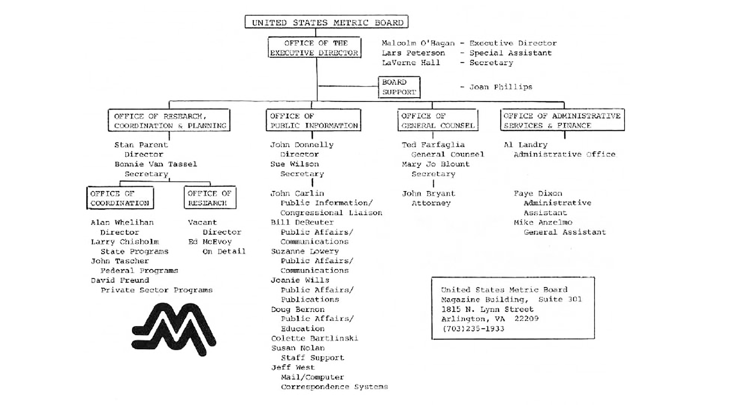
United States Metric Board (USMB), 1975-1982
The United States Metric Board is exactly what it sounds like. Set up under Gerald Ford as a response to the The Metric Conversion Act of 1975, it would attempt–and ultimately fail–to encourage or achieve metrication in the US. We’re still on the empirical system of measurement and the USMB logo is still extremely cool. Ronald Regan, notable UFO-enthusiast and failed actor, abolished the board in 1982 when he learned what the metric system was.


United States Life-Saving Service, 1848-1915
The US Life-Saving Service was apparently some kind of humanitarian effort at the time to help “save the lives of shipwrecked mariners and passengers”.
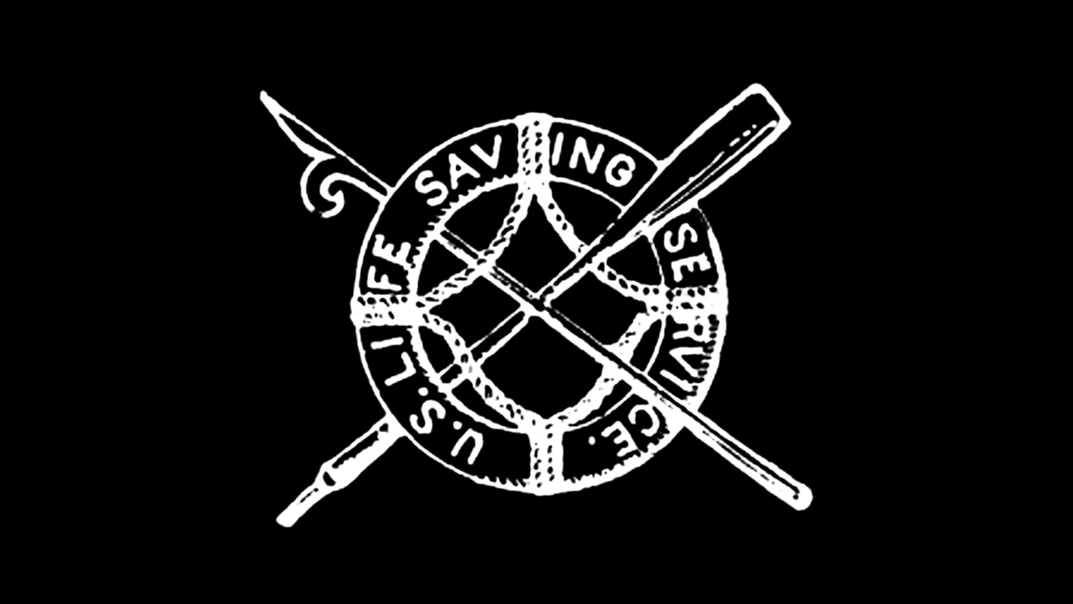
United States Revenue Cutter Service, 1790-1915
The Life-Saving Service would ultimately merge with the US Revenue Cutter Service in 1915 to form the Coast Guard. These two maritime-focused agencies did a pretty decent and pragmatic job of using symmetry, typography, and symbology to craft their logos at a time when people still believed in sea monsters.

The Civilian Conservation Corps (CCC), 1933-1942
The CCC was possibly the most popular of the New Deal programs. It would give work and hope to hundreds of thousands of young citizens who would be out developing and maintaining natural resources across the country. Missions included tree planting, firefighting, stream improving, trail building, mosquito control, among other outdoorsy pursuits.
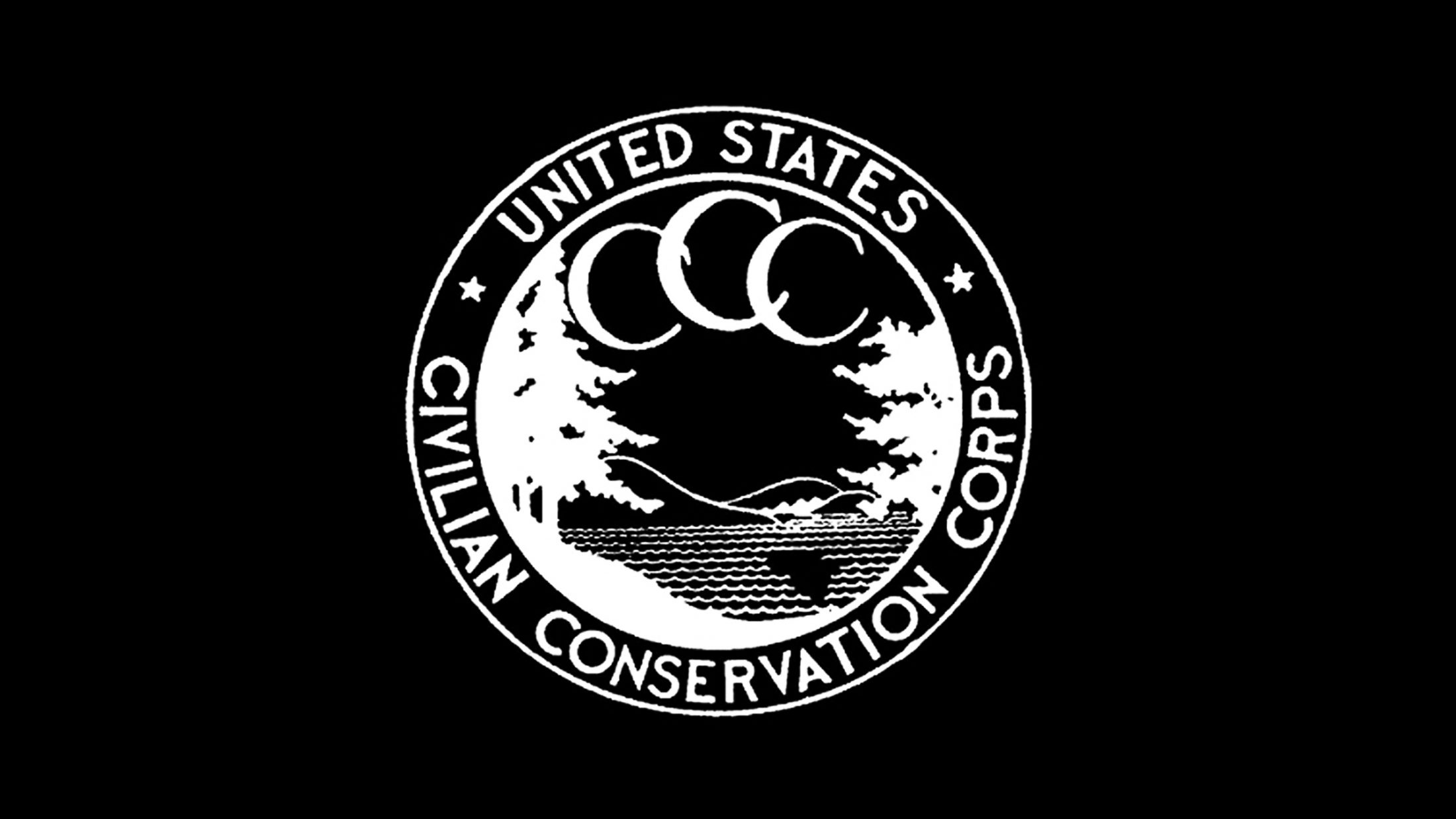

The seal uses a geometric sans-serif typeface that kind of resembles Futura. The symmetry and kerning of the arch is pretty good and holds it’s weight as a mark even by modern standards. The interior illustration–some kind of idyllic natural landscape–resembles a lot of contemporary design trends but the typographic-based triple crescent moon situation reveals the age of the logo.

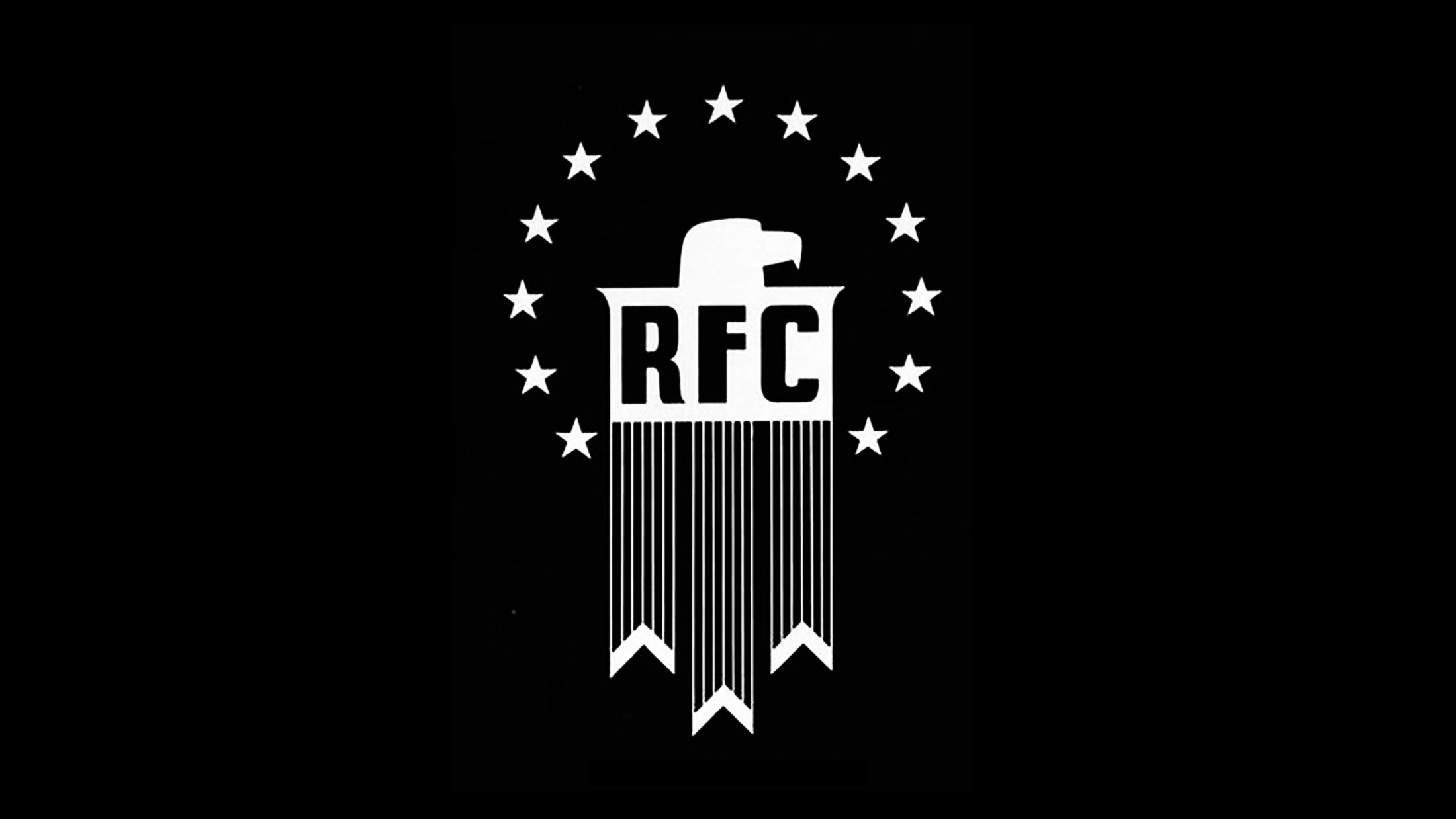
Reconstruction Finance Corporation (RFC), 1932-1957
The Reconstruction Finance Corporation appears to have been a massive money pumping machine created to stimulate lending into the battered economy during and immediately after the Great Depression. It is unclear what the 13 stars around the flat-headed eagle represent–one can assume these inappropriately reference the original colonies, which had their own economic issues, or perhaps the 13 circles of hell small businesses would find themselves in once owing back interest on their federal loans.
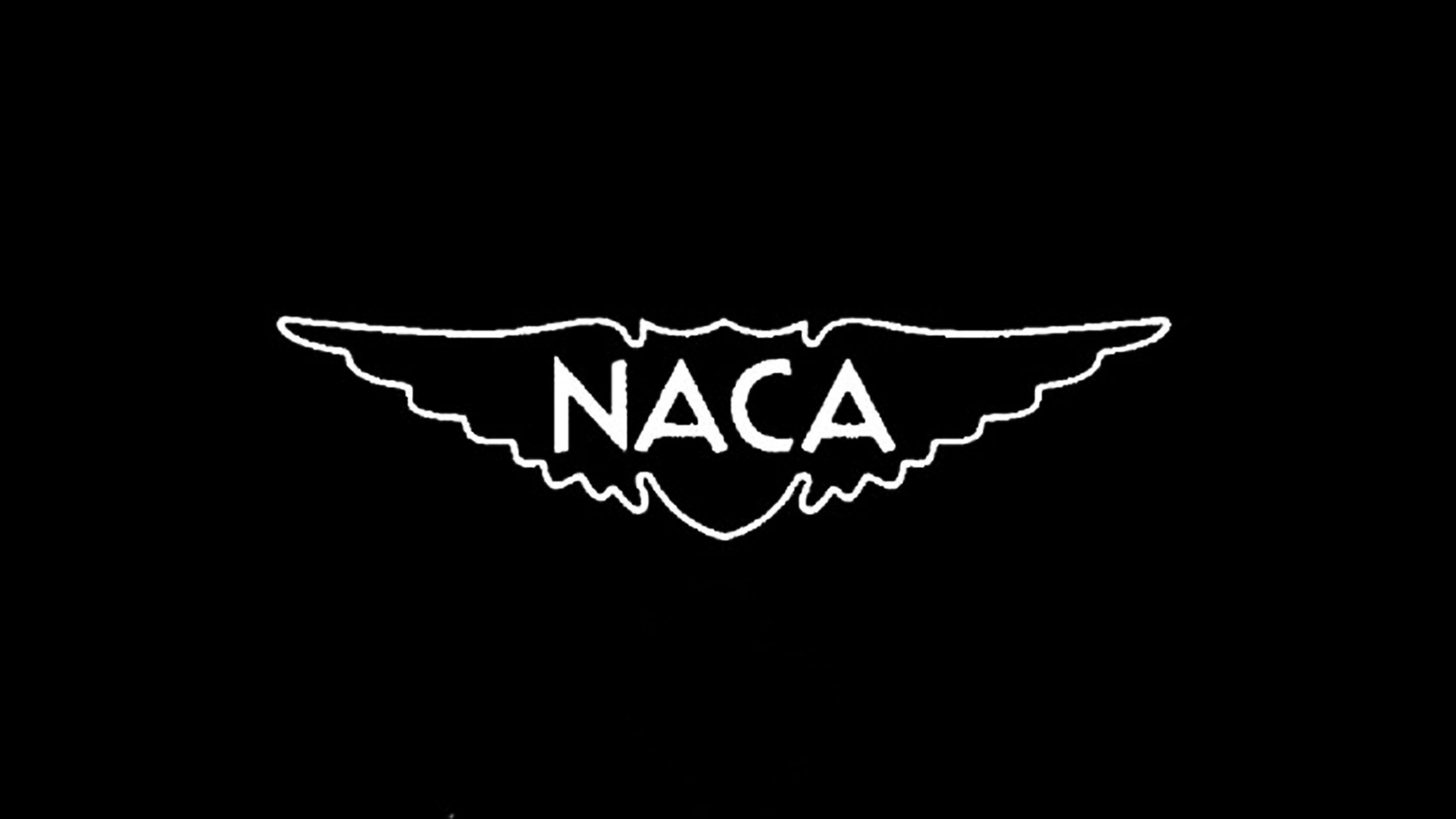
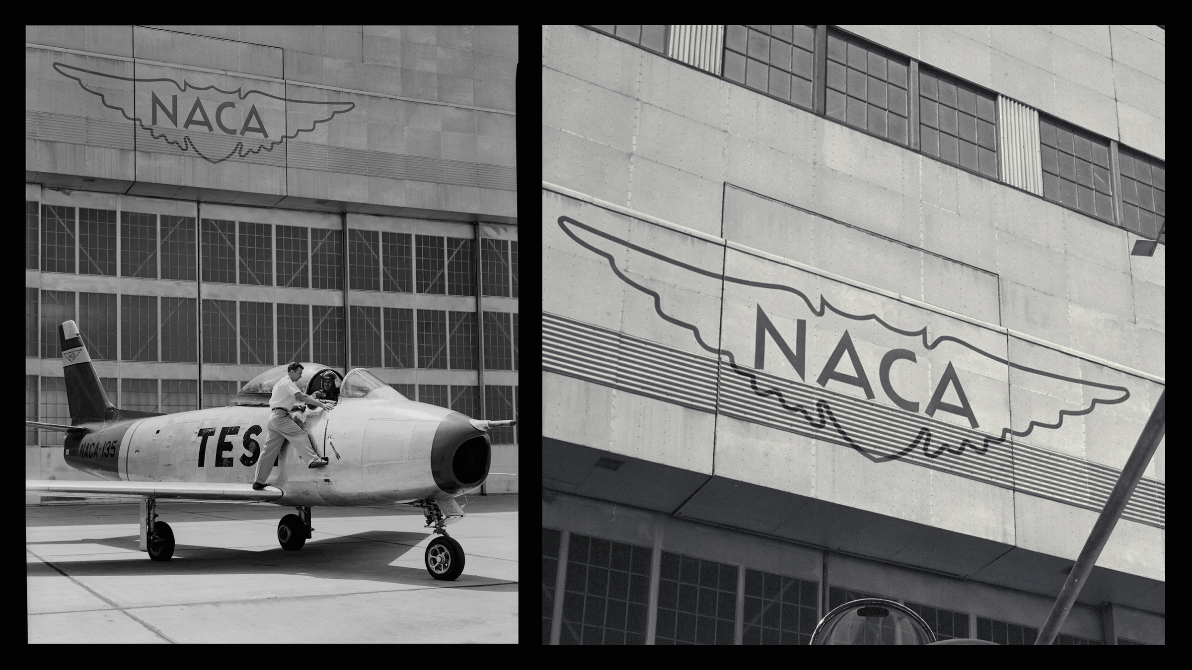
National Advisory Committee for Aeronautics (NACA), 1915-1958
NACA was founded in 1915 to undertake, promote, and institutionalize aeronautical research. It was dissolved and merged into NASA in 1958. Most iterations of the logo are some variation of a central shield flanked by two wings with the geometric sans-serif acronym in the center.

The Interstate Commerce Commission (ICC), 1887-1996
The ICC was established by the Interstate Commerce Act of 1887 in order to reign in the completely out-of-control railroad industry, which at the time abused its monopoly on power and transportation by taking over towns and bribing politicians and journalists with free rides. The seal itself is not entirely surprising for an agency of the time and pretty standard as far as eagle marks go.


Student Loan Marketing Association (SLMA), 1972-2004
The SLMA was set up in 1972 as a federal entity to issue student loans. This would later become fully privatized and given the disarming, misleading, and haunting name Sallie Mae. The illustration below was taken from a 1980’s era bond certificate. While not technically a logo, it is at least what some hapless prospective education-havers at the time would come to know as the face of the organization and as the face(s) of their nightmares.

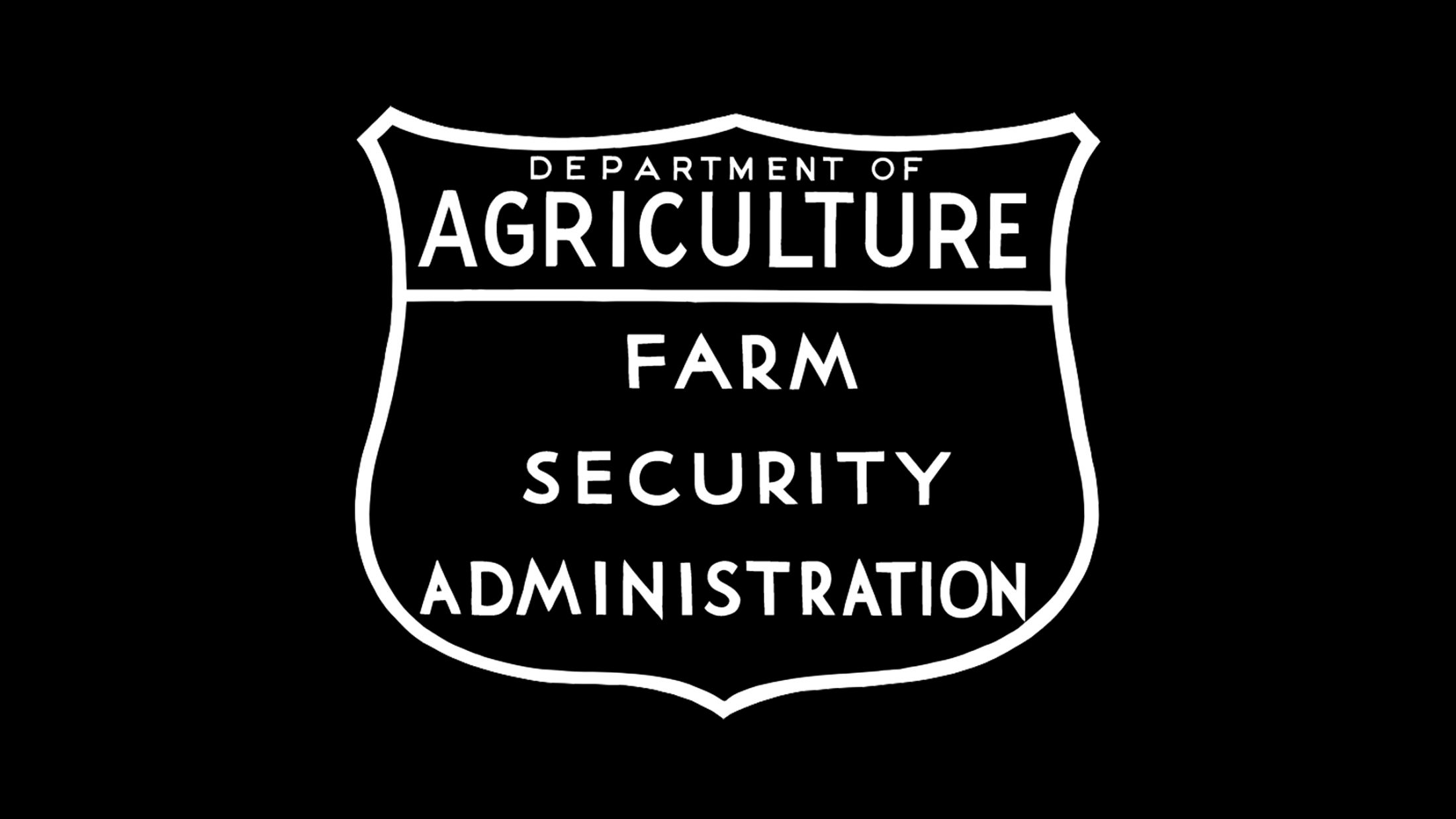
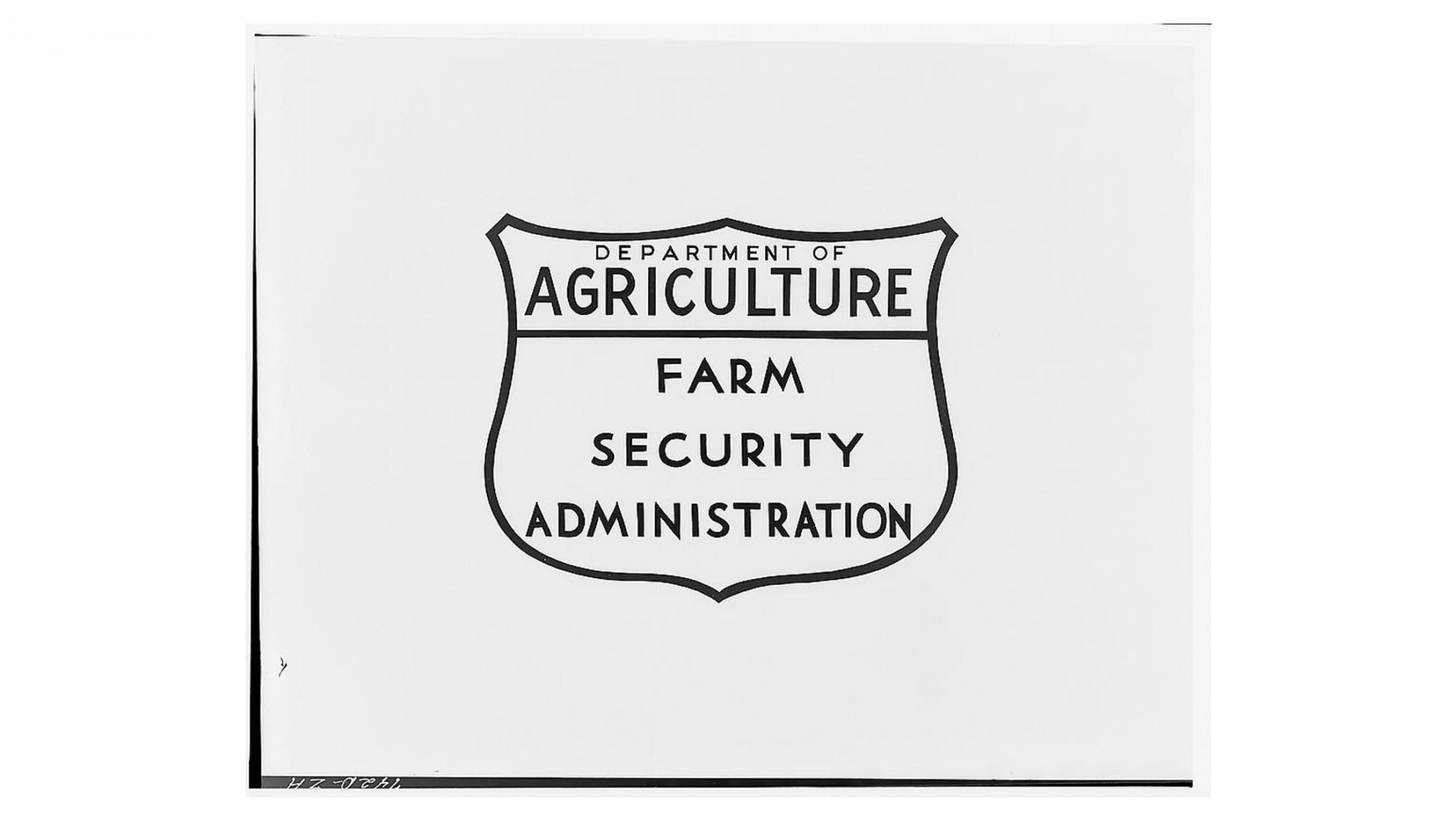
Farm Security Administration (FSA), 1937-1946
The FSA was a New Deal agency created in 1937 to combat rural poverty during the Great Depression. Its logo features an outer shield and a very hand-drawn, folksy-feeling geometric sans-serif.

This list of logos is not exhaustive and if your favorite logo is missing let us know. Many government logos that came to power and were dissolved into other agency emblems were not mentioned here (like the original Social Security Administration logo, the NASA logo, and others). Please keep paying your taxes and pay your logo designers a living wage.